
Dental clinic
Bosco Dentista
“All the happiness in a smile”
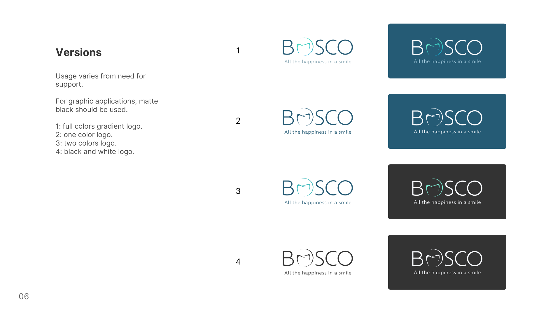
The brand identity we designed for Bosco, delivered as a complete guideline. This page is the same manual, made to be used on a phone at the counter instead of being downloaded and forgotten.
The mark
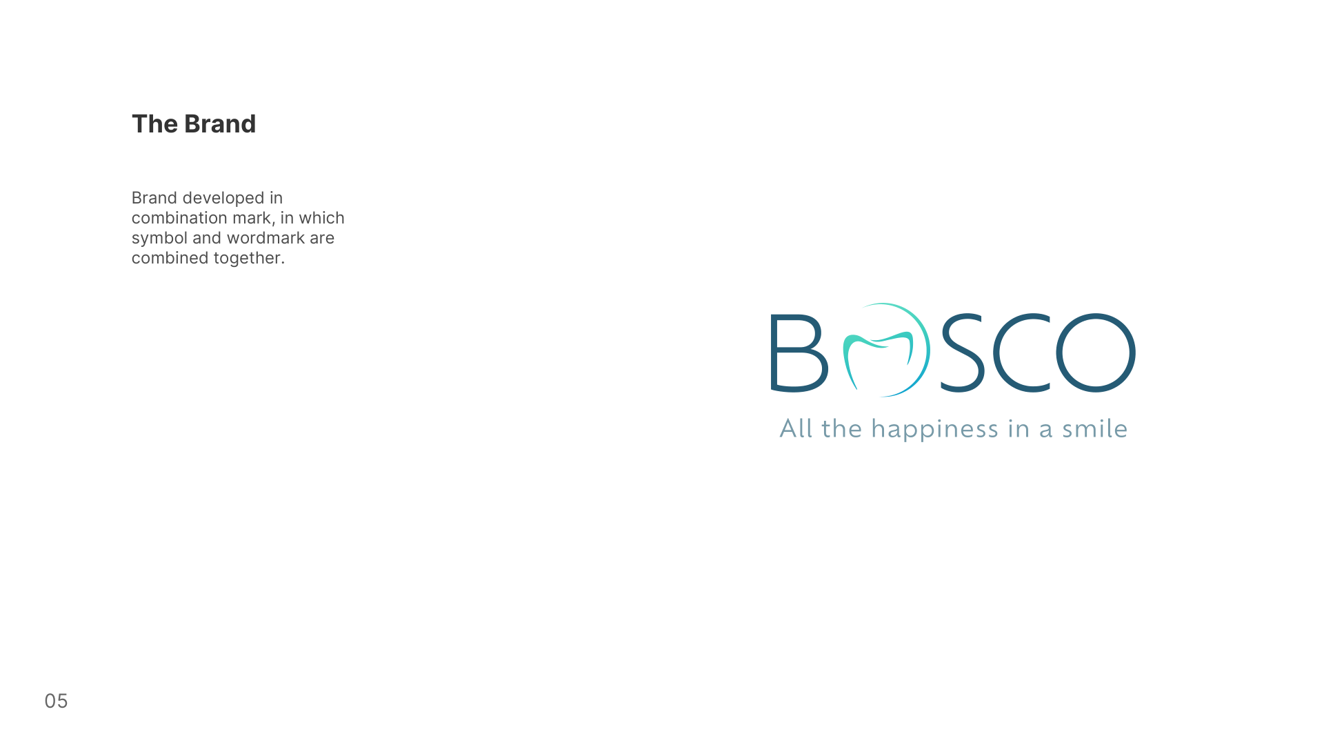
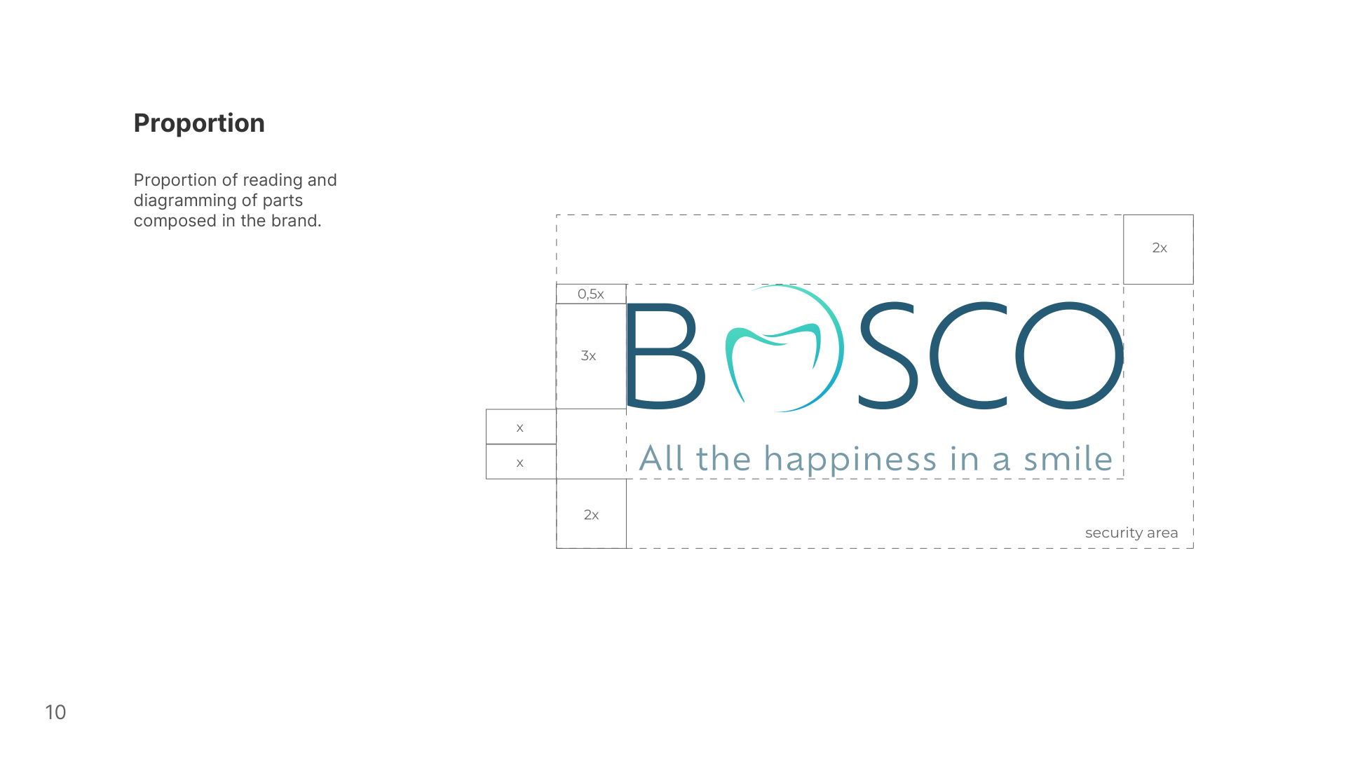
Developed as a combination mark, in which symbol and wordmark are joined together. The tooth sits inside the open O — the symbol is not an ornament beside the name, it is part of reading it, which is why the mark cannot be split into “logo” and “name” by whoever lays out the next flyer.
Colours
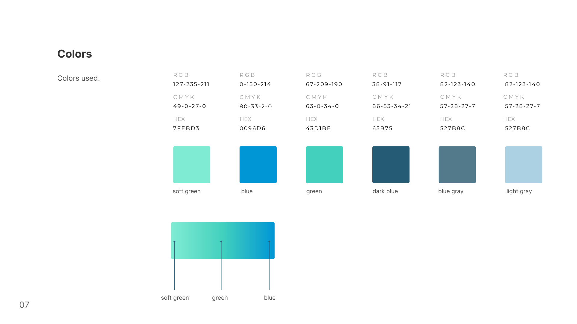
Six colours, plus the gradient that runs soft green to blue — the same gradient the manual uses to build the logo. Every one sits in the same family, teal through to deep blue, which is what makes any piece of clinic material read as one brand without a designer in the room. Click or tap any value to copy it.
Soft green
RGB 127 · 235 · 211
CMYK 49 · 0 · 27 · 0
Green
RGB 67 · 209 · 190
CMYK 63 · 0 · 34 · 0
Blue
RGB 0 · 150 · 214
CMYK 80 · 33 · 2 · 0
Dark blue
RGB 38 · 91 · 117
CMYK 86 · 53 · 34 · 21
Blue gray
RGB 82 · 123 · 140
CMYK 57 · 28 · 27 · 7
Light blue
RGB 172 · 209 · 228
CMYK —
Three things are corrected here against the original PDF, all checked by sampling the pixel of the swatch itself: dark blue prints as “65B75” (a digit is cut off — it is #265B75), light blue repeats the blue gray values by mistake, and the sixth swatch is labelled “light gray” in the manual when it samples as #ACD1E4 — a light blue. We kept the colours and corrected the labels.
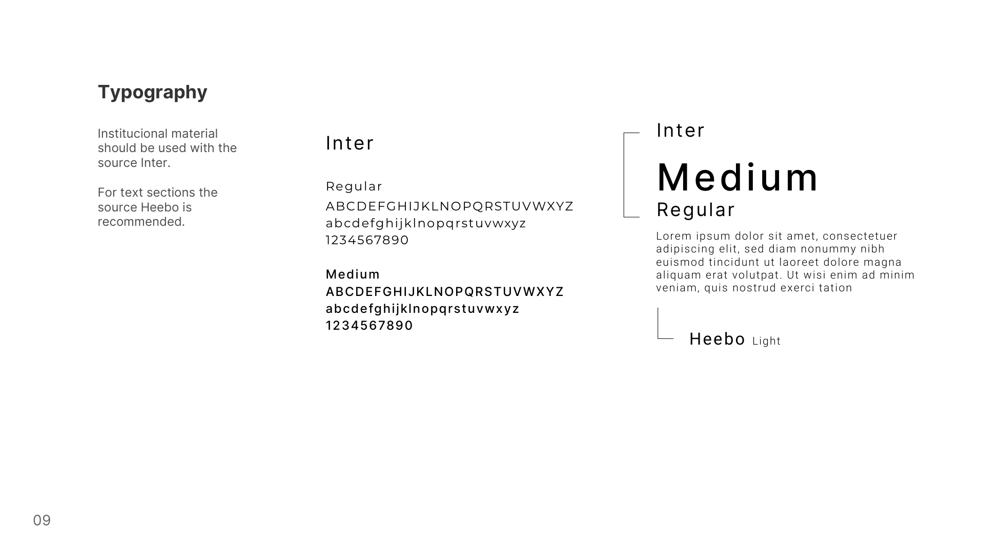
Typography
Inter
Regular · Medium
Institutional material — anything carrying the clinic's name.
Heebo
Light
Recommended by the manual for body text.
The manual, as delivered
Pages from the original document. The full PDF is linked at the top of this page.
What not to do with the logo
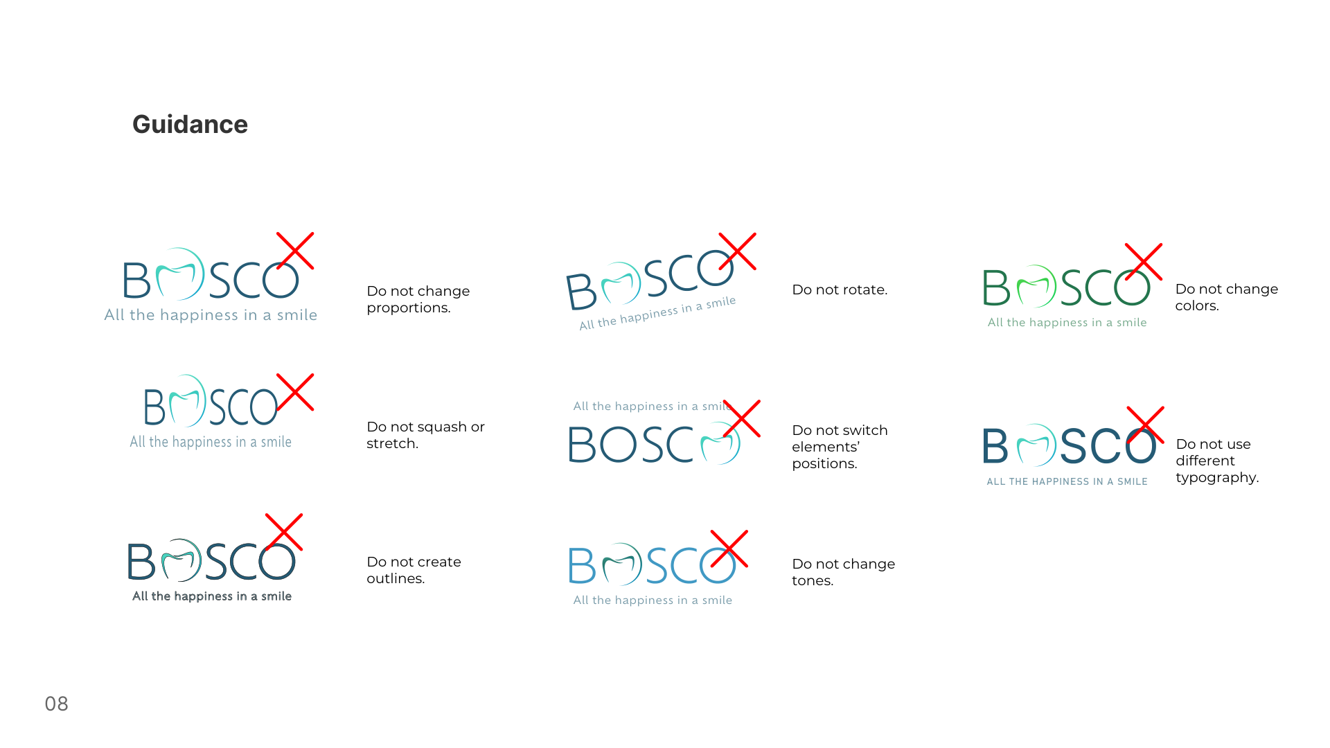
The eight rules from the manual. They exist because a logo works by being recognised, and each of these changes moves the mark away from the version people have already seen.
- Do not change proportions
- Do not rotate
- Do not change colours
- Do not squash or stretch
- Do not switch the elements' positions
- Do not use different typography
- Do not create outlines
- Do not change tones