
Signage and visual communication
SMC Screen
“Your brand in focus”
The full visual identity we designed for SMC Screen — logo, colour system and guidelines — alongside the website built on it.
The mark
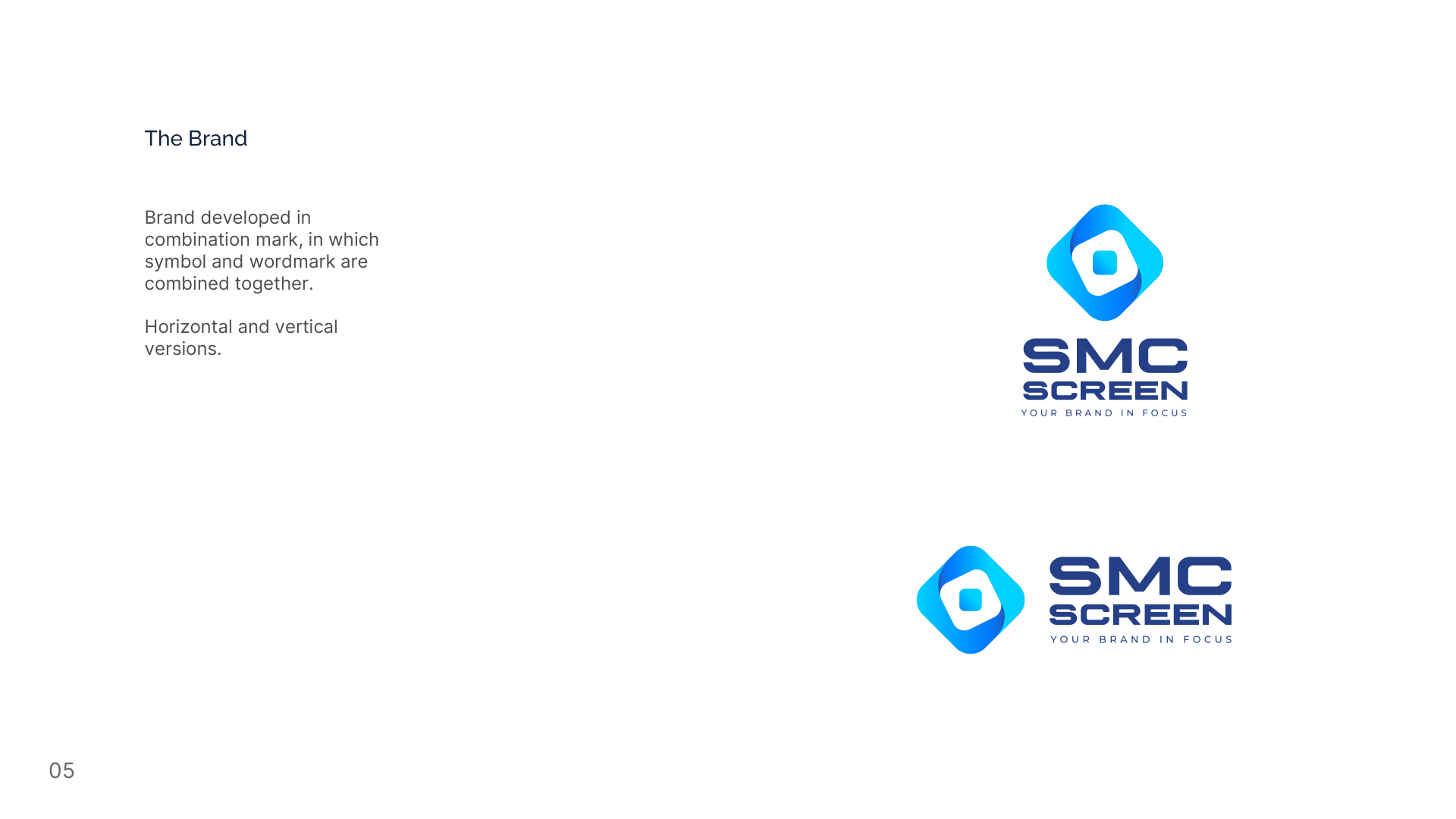
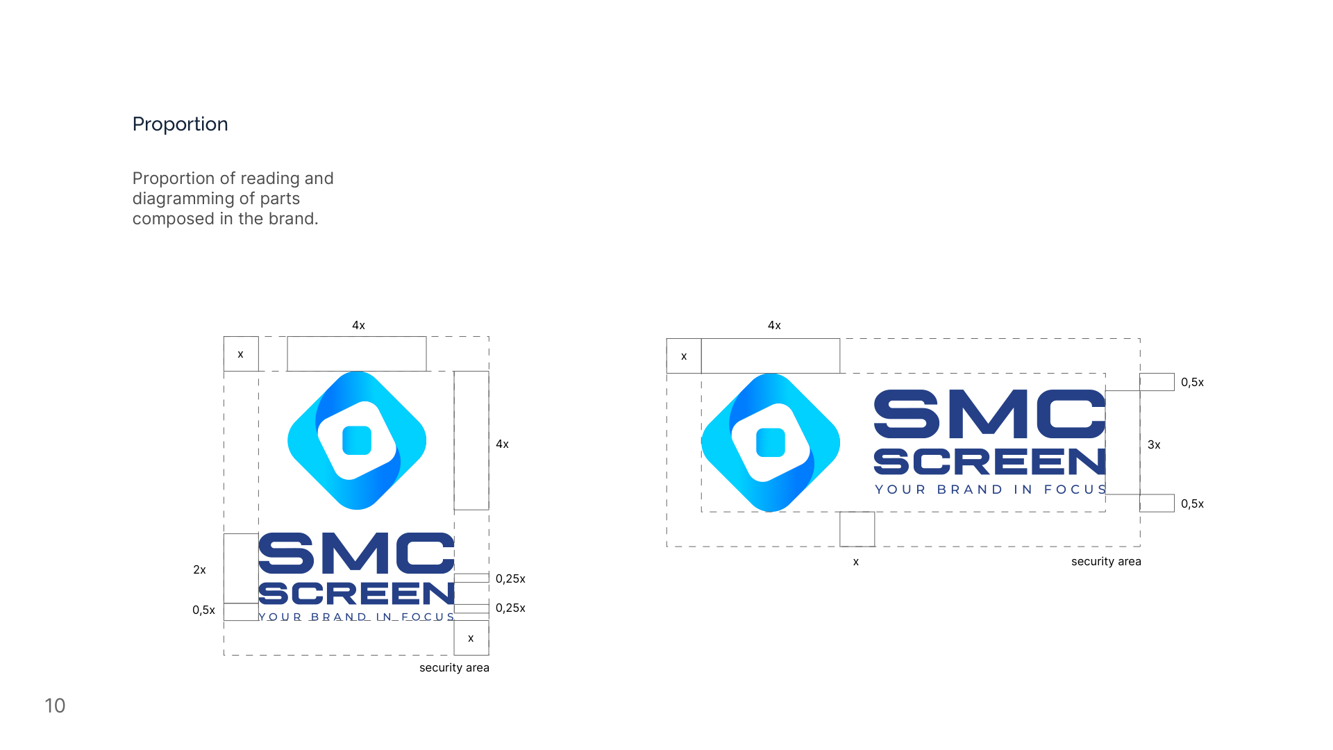
A rounded diamond with an aperture at its centre, beside the wordmark — the manual delivers it in horizontal and vertical versions. The shape reads as a screen and as an aperture at once, which fits a name about focus. It is built from three nested shapes and no fine detail, and that is what keeps it printable at any size: a mark with hairlines loses them on a vehicle wrap and on an embroidered shirt, and this one has none to lose.
Colours
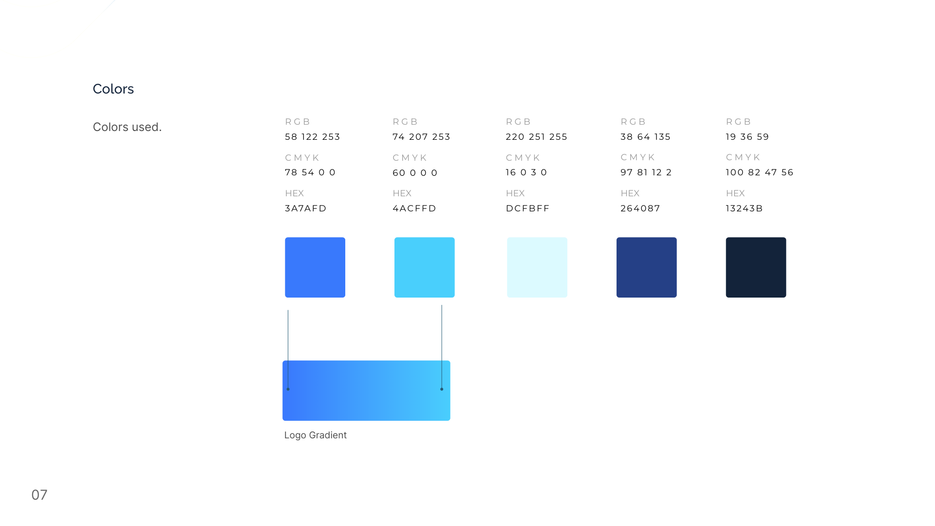
Five blues, from near-white to near-black, plus the gradient that builds the logo. A single hue across the whole range keeps every piece recognisable as one brand, and the near-black at the end is what gives the palette somewhere to put text — a range of blues without a dark anchor has nothing legible to write with. The pairing still has to be light against dark: Ice on Night reads at 14:1, Sky blue on Ice does not read at all. The manual gives the values without names; the names here are ours, so the palette can be talked about. Click or tap any value to copy it.
Bright blue
RGB 58 · 122 · 253
CMYK 78 · 54 · 0 · 0
Sky blue
RGB 74 · 207 · 253
CMYK 60 · 0 · 0 · 0
Ice
RGB 220 · 251 · 255
CMYK 16 · 0 · 3 · 0
Deep blue
RGB 38 · 64 · 135
CMYK 97 · 81 · 12 · 2
Night
RGB 19 · 36 · 59
CMYK 100 · 82 · 47 · 56
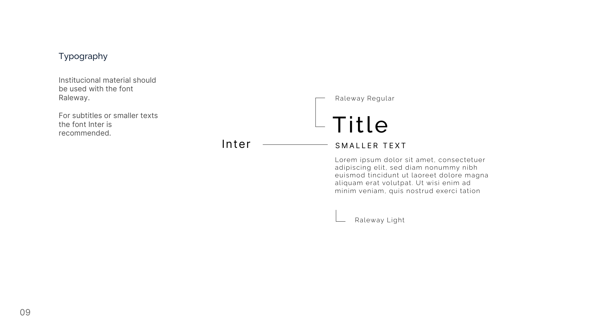
Typography
Raleway
Regular · Light
Institutional material and titles. Light carries the body text.
Inter
Regular
Recommended by the manual for subtitles and smaller text.
The brand applied
A brand manual that stops at the logo leaves the hardest part undone. These pages take the mark to where it is actually used — printed on a card, embroidered on a jacket, curved around a mug — because each of those surfaces breaks a mark in a different way, and the only way to know it holds is to place it there.
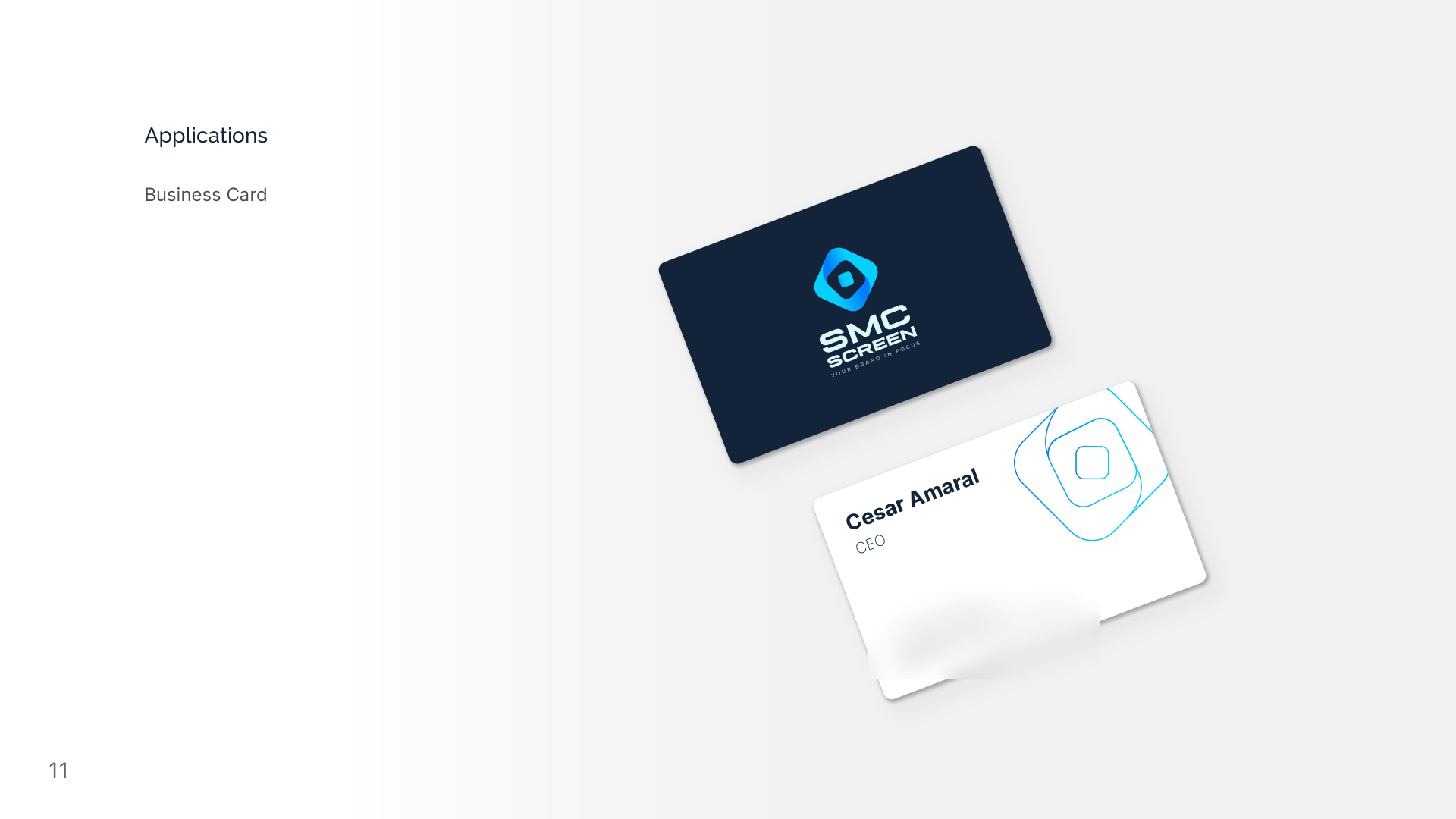
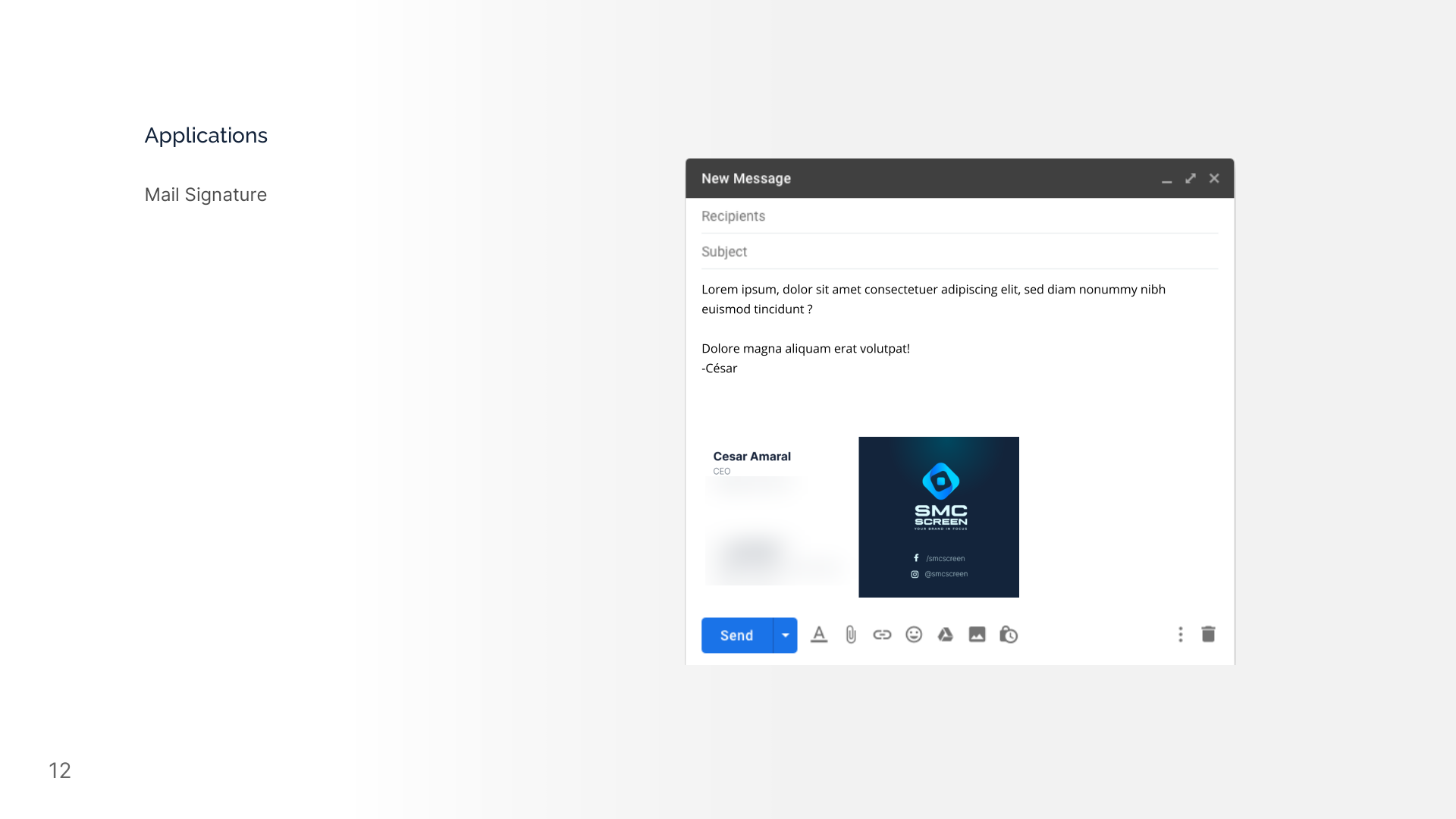
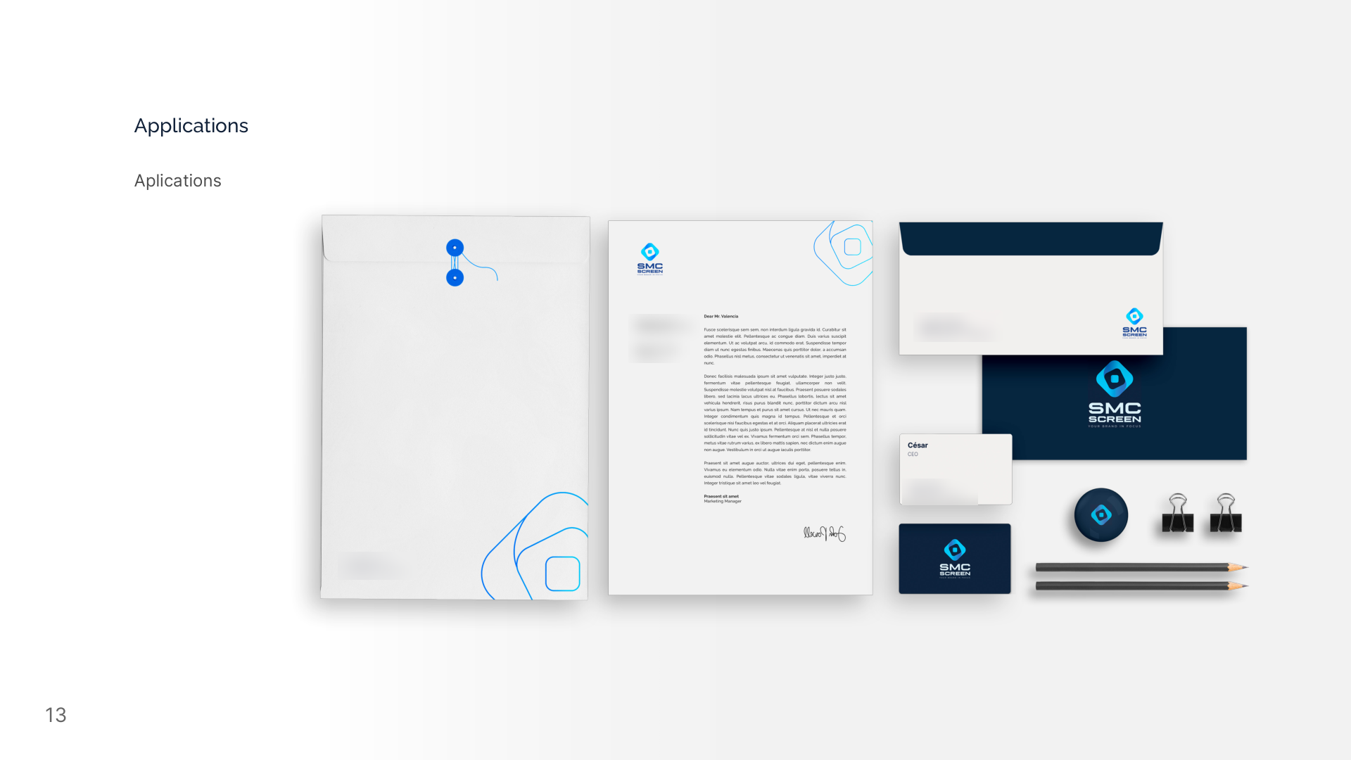
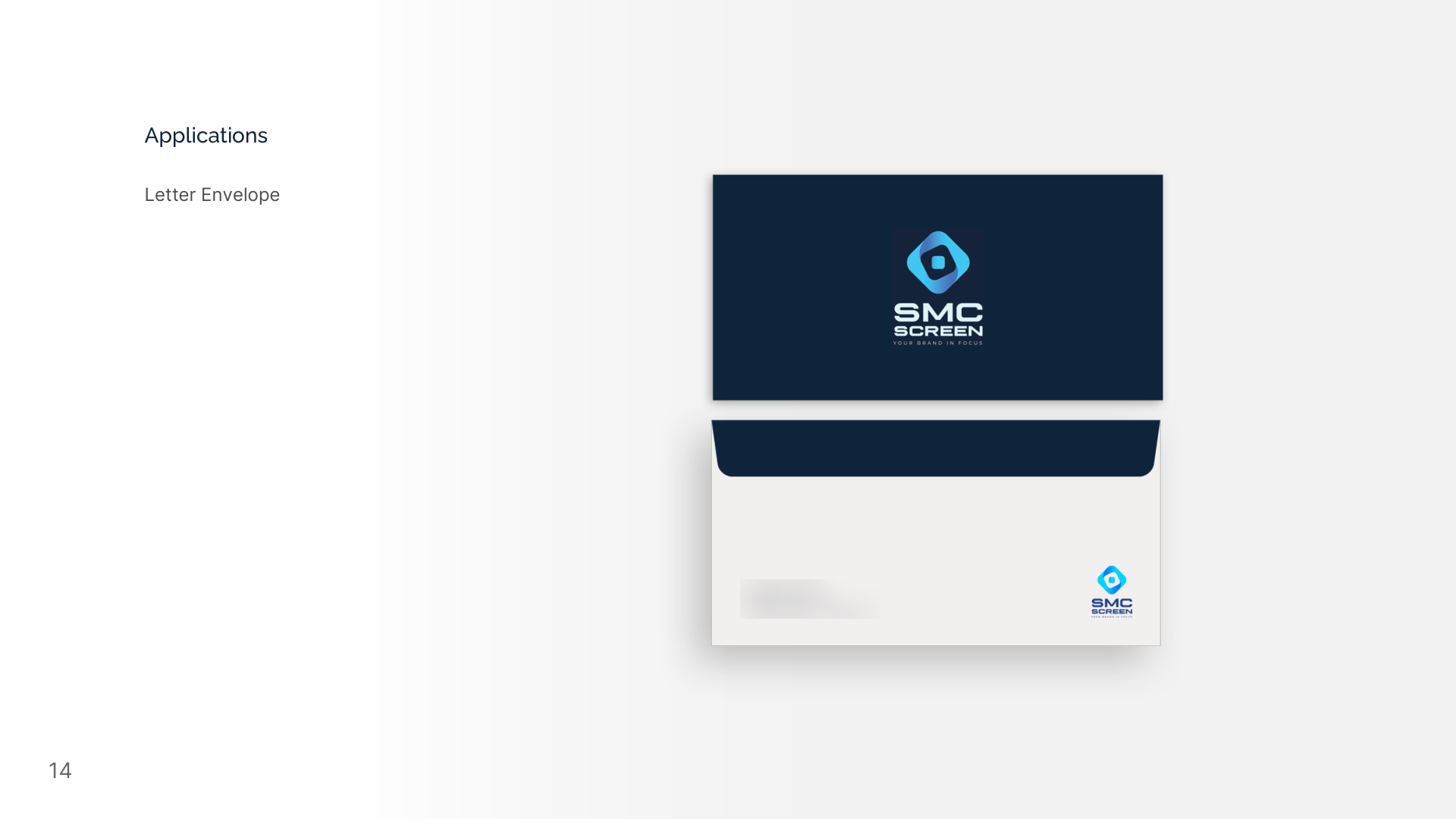
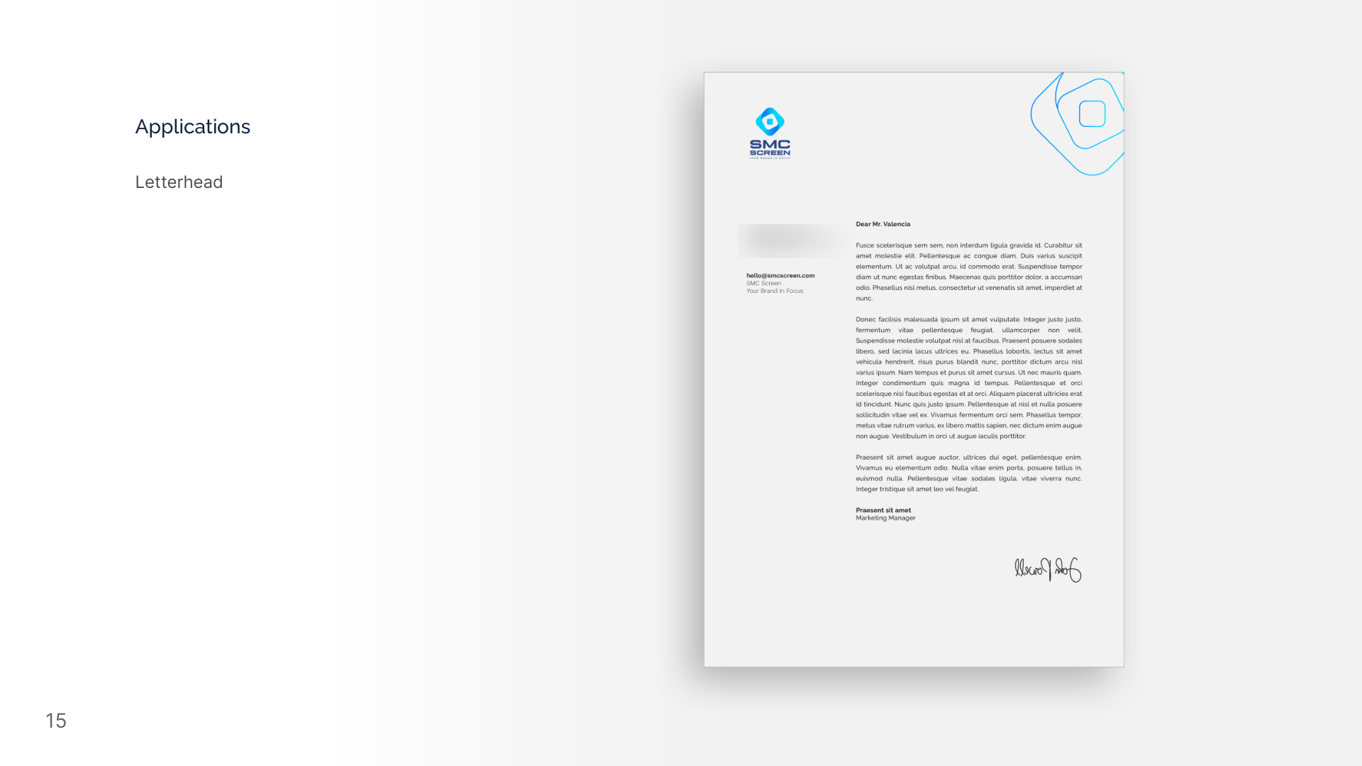
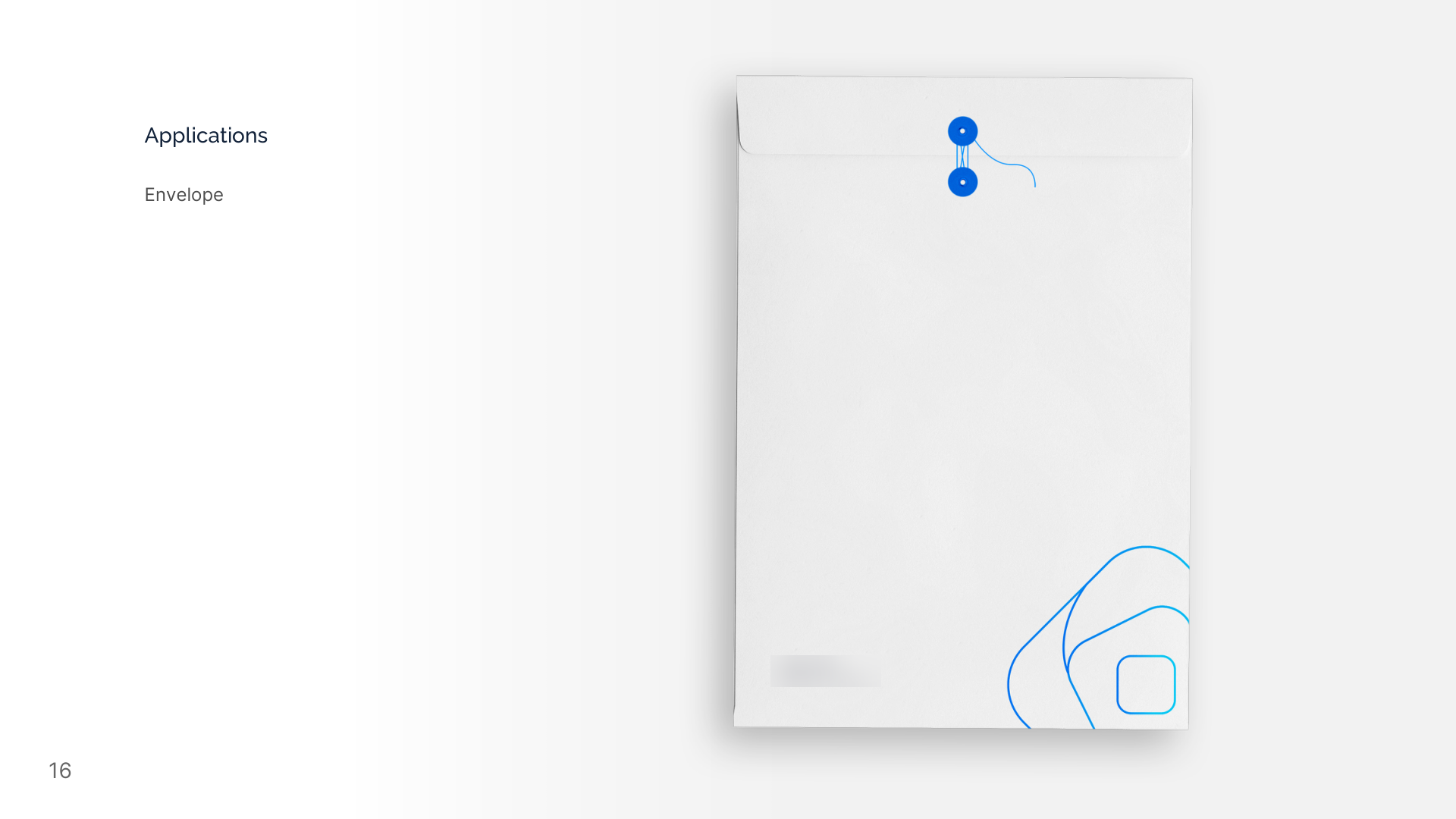
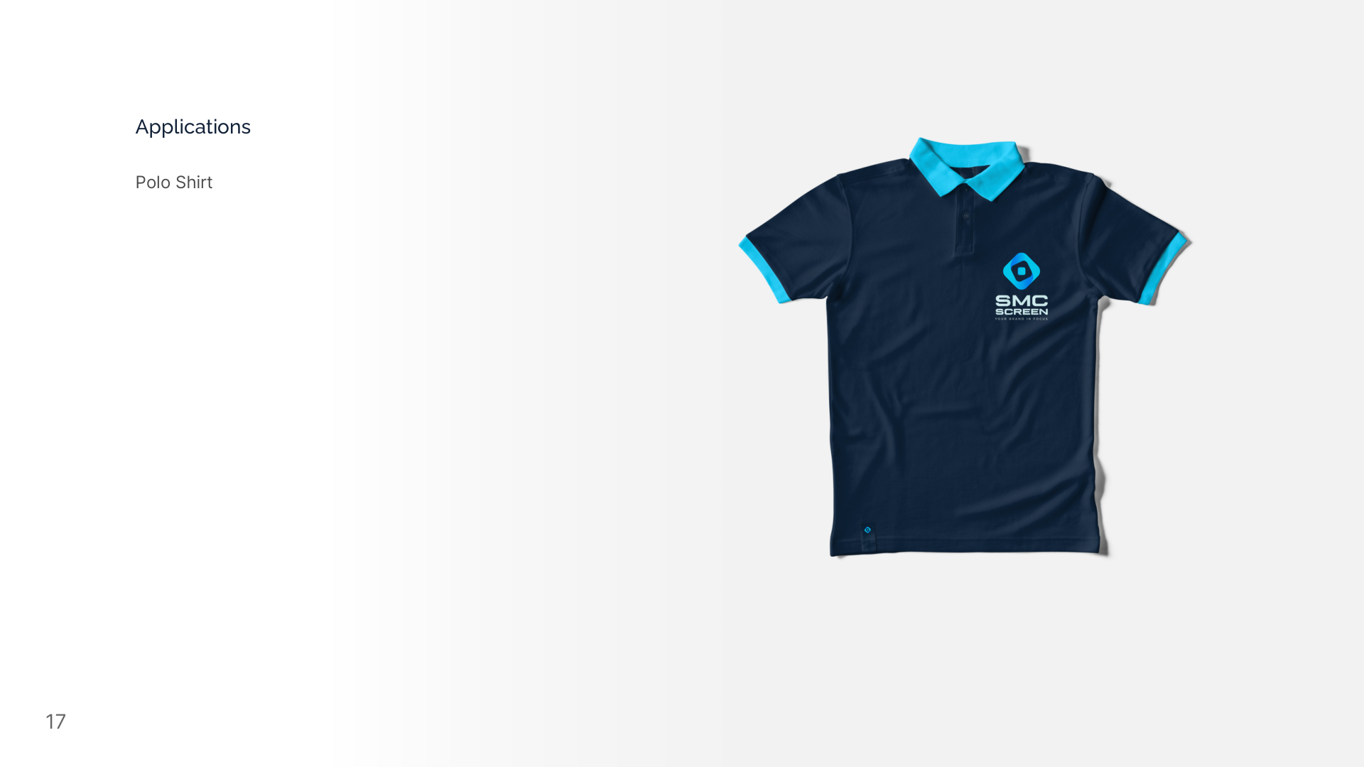
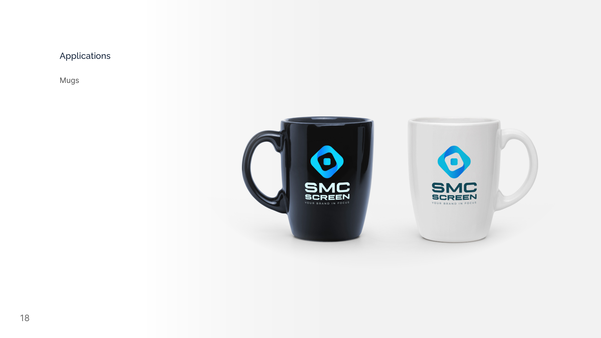
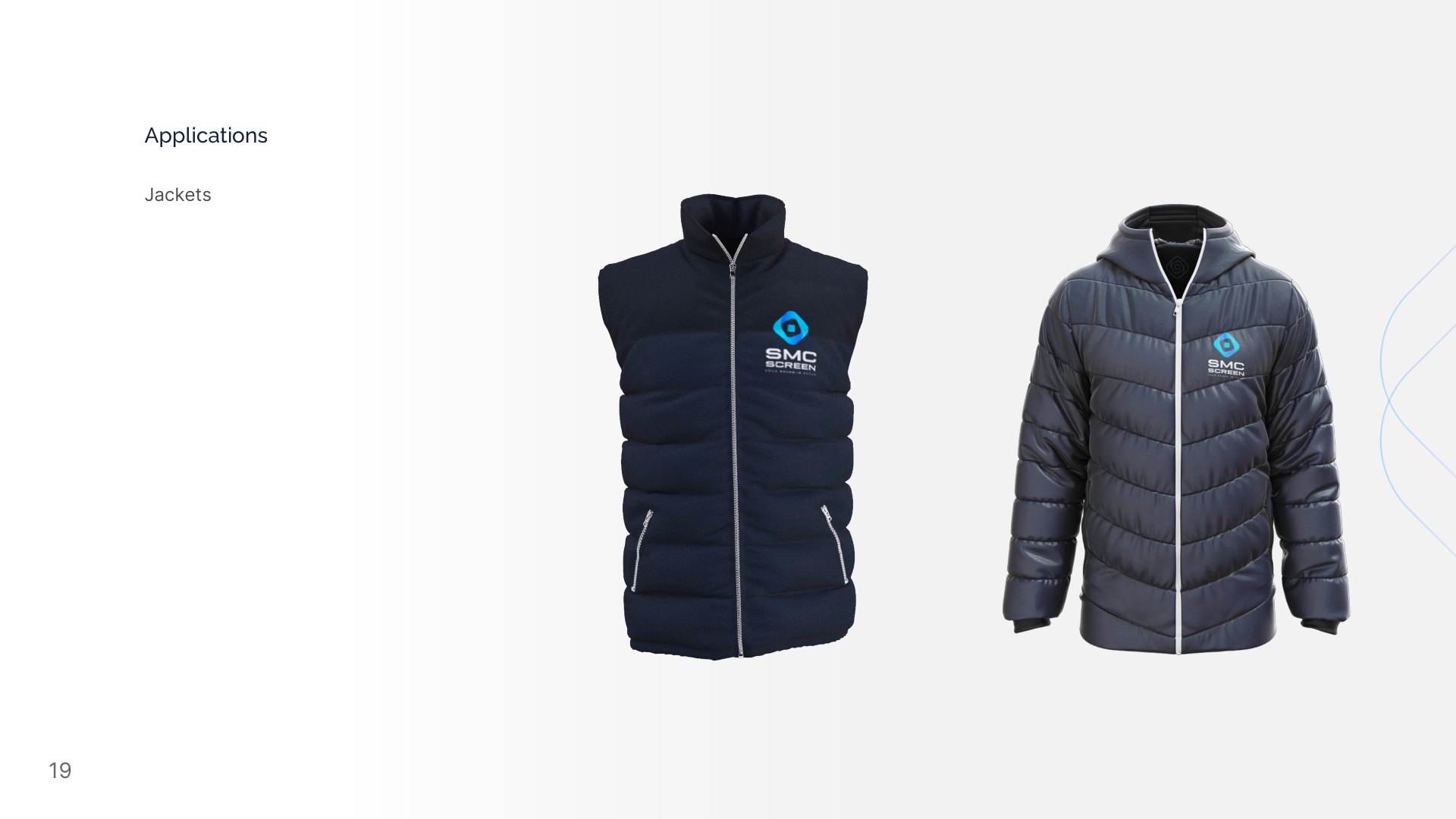
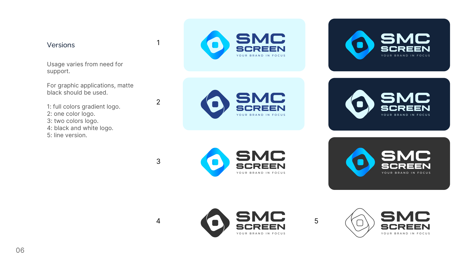
The manual, as delivered
Pages from the original document. The full PDF is linked at the top of this page.
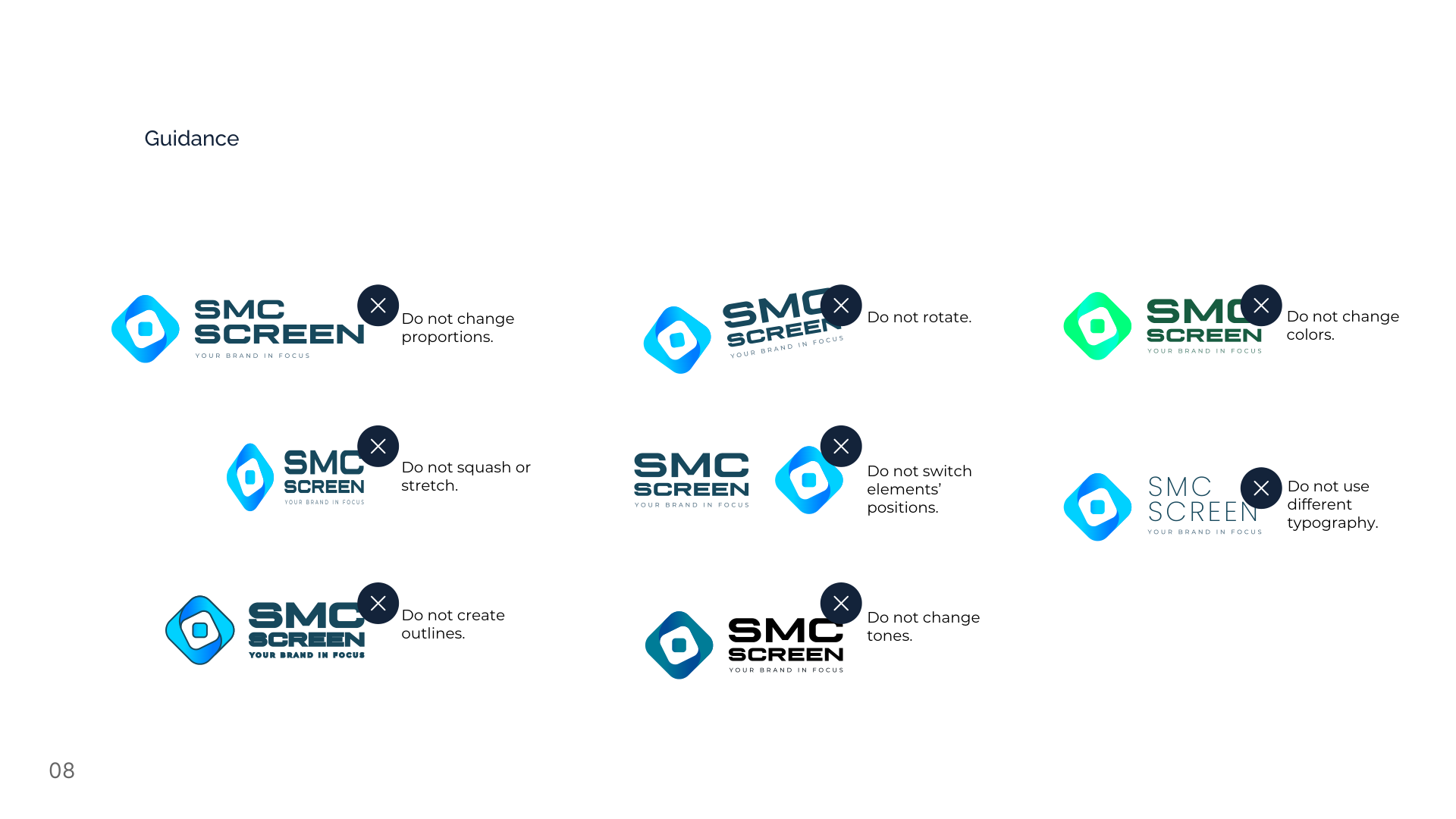
What not to do with the logo
The eight rules from the manual. Signage is where they are hardest to keep: the same mark goes onto a fascia, a van and a shirt, each made by a different supplier, and every one of these changes produces a mark that is nearly right — which is the version nobody recognises.
- Do not change proportions
- Do not rotate
- Do not change colours
- Do not squash or stretch
- Do not switch the elements' positions
- Do not use different typography
- Do not create outlines
- Do not change tones