Butcher and delicatessen
DoubleDeli
The brand identity manual we produced for DoubleDeli — a butcher and delicatessen carrying two flags in its mark.
The mark
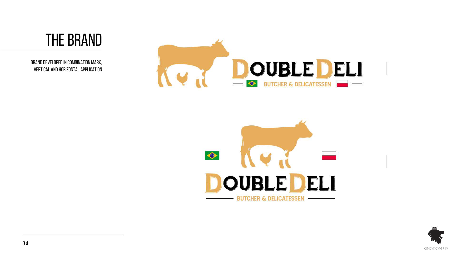
A cow with a chicken inside its silhouette, and the Brazilian and Polish flags framing the descriptor line. The manual delivers it in horizontal and vertical versions: in the vertical one the animal sits above the wordmark and the flags move to its sides. Two flags in a butcher's mark do work no sentence has to do — a customer recognises their own before they have read the name.
Colours
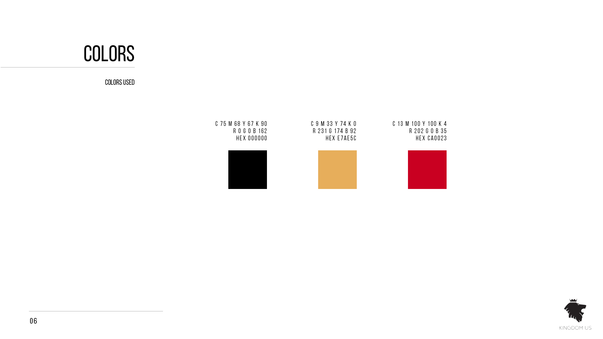
Three colours only. A butcher's brand does not need more, and the restraint is what keeps it legible on a shopfront, a label and a price board.
Black
RGB 0 · 0 · 0
CMYK 75 · 68 · 67 · 90
Gold
RGB 231 · 174 · 92
CMYK 9 · 33 · 74 · 0
Red
RGB 202 · 0 · 35
CMYK 13 · 100 · 100 · 4
One value is corrected here: the black prints its RGB as “0 0 162”, which cannot be black. Sampling the swatch in the document returns #000000, matching the HEX the manual itself gives.
Typography
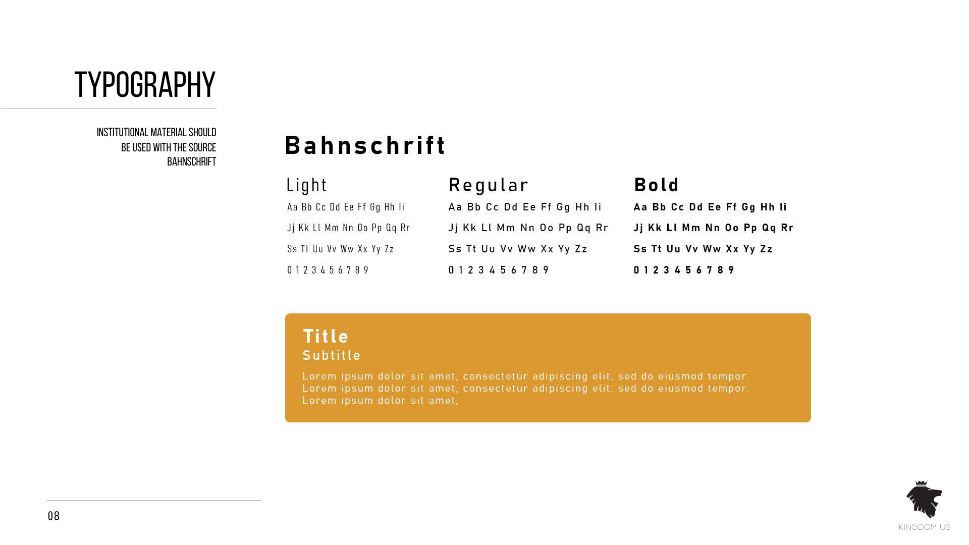
Bahnschrift
Light · Regular · Bold
One family for everything, in three weights. A DIN-derived grotesque holds its shape at the size a shop sign needs and still reads in a paragraph, which is what a butcher's brand asks of type.
The manual, as delivered
Pages from the original document. The full PDF is linked at the top of this page.
Clear space
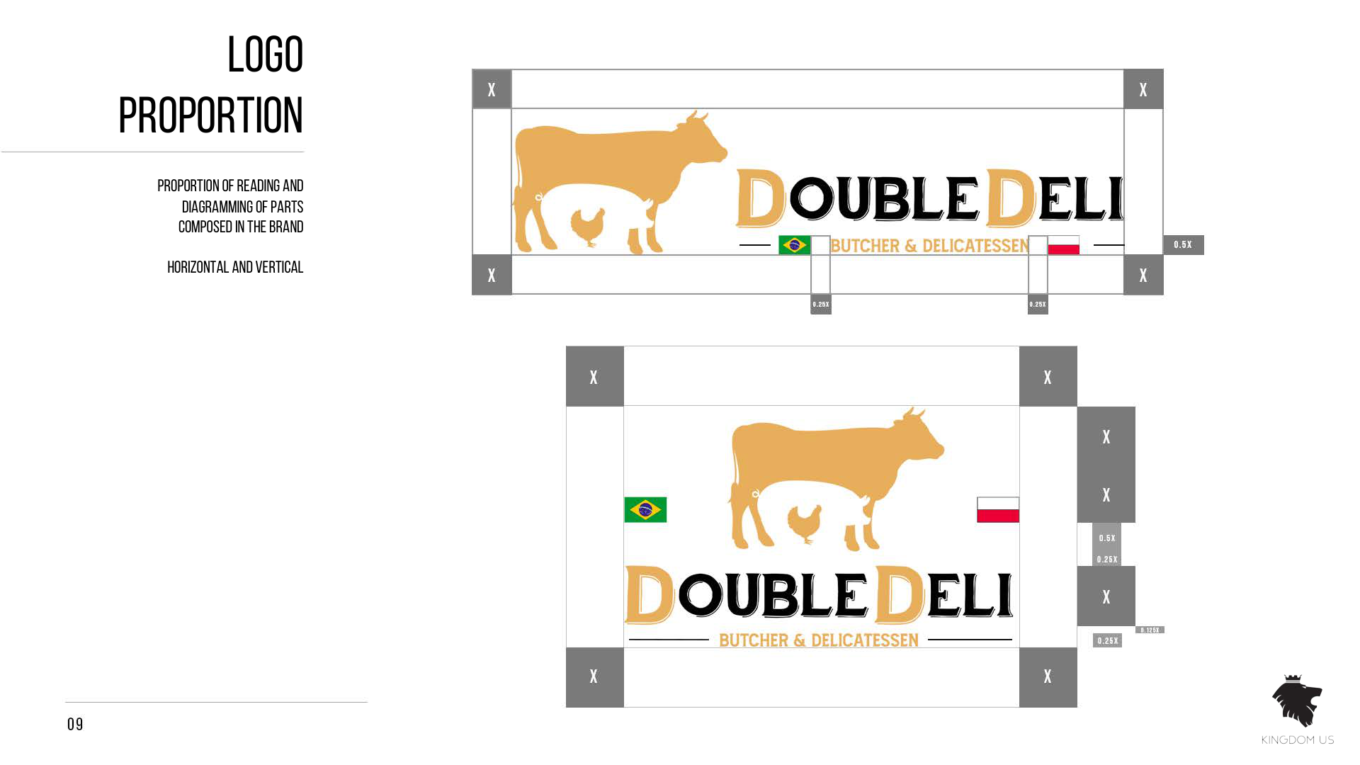
The manual defines the space that must stay empty around the mark, measured in fractions of the logo's own height: X at the corners, 0.5X and 0.25X for the tighter margins. It exists so the logo is never crowded by other elements.
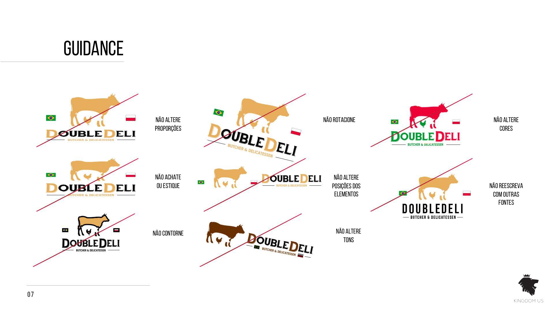
What not to do with the logo
The same eight rules the other manuals carry. A butcher's mark ends up reproduced by whoever prints the next label or window sticker, and these are the eight ways it stops being the same mark.
- Do not change proportions
- Do not squash or stretch
- Do not create outlines
- Do not rotate
- Do not switch the elements' positions
- Do not change tones
- Do not rewrite it in another typeface
- Do not change colours